10.3. Step 1: Draw Contours In Pencil#
Begin by drawing your lines in light pencil and then examine this preliminary analysis.
Where are the wiggles that can’t be justified by the data?
Draw in new smoother lines where the wiggles are not justified
(consistent with the data of course!).
Smooth out any sharp changes in gradients.
Even the most experienced synopticians mess up occasionally, so make
use of that pencil and eraser.
Drawing Contours#
How do I draw a contour? Answer: Interpolation
When drawing contours of a field (also called isopleths), the technique of interpolation should be favored over extrapolation. Thus, a contour is usually placed closer to the data point whose value is nearer that of the contour (Fig. 10.1). However, other factors, such as internal consistency and the possible presence of inaccurate or ‘bad’ data must also be considered. In these cases, an exact interpolation between data points in your analysis is not always the best way to go. Particularly in data sparse regions, you should utilize wind information to help you with your pressure or height analysis.
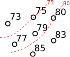
Fig. 10.1 Example of isotherms. Go through values that appear and place the line at the approximate location that the value of the isopleth would occur.#
Missing Data#
No Data? Answer: No contours!
Good synopticians do not extrapolate data contours in large data void regions (such as the Gulf of Mexico and the Atlantic and Pacific Oceans on all maps, the Rockies at 850 mb, and underground areas on isentropic charts), as there is no data there. If the fields you are analyzing appear coherent and on either side of the data void region, you may connect your contours through the region using a series of dots in the appropriate color. This indicates that there is a significant amount of uncertainty in this area and the dots represent a rough estimate. But one should be cautious about how you draw any lines through a data void region.
Under no circumstances should contours be connected by circling around the boundaries of a map, over oceans, or other extremely large bodies of water.
Bad Data#
Is the observation bad?
Be on the lookout for bad data points. If you question a particular value, check neighboring points. If they are significantly different, you may want to ignore the point. Also examine the same station’s data at other available pressure levels. If they are also spatially inconsistent, you may be visiting Bad Dataville. In problem areas, look at analyzing the available information several different ways and then disregard any data point(s) that result in an unrealistic analysis. Remember, disregarding a data point is a judgment call (as it may be due to a real process), but your analysis should make sense!
Be acutely aware of the presence of thunderstorms, as their effects can introduce noise into a synoptic scale analysis. At the surface, look for thunderstorms, lightning, heavy precipitation, gust fronts, meso-highs, etc. In synoptic analyses, these effects can often be treated judiciously as bad data. Remember that thunderstorms often affect the analysis at several levels.