14.2. Color-filled Contouring#
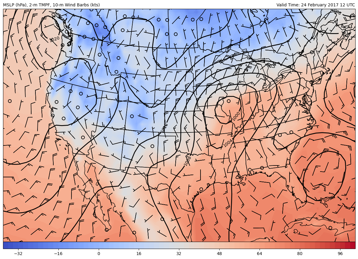
This notebook creates an example of overlaying color-filled contours and regular contours over the CONUS.
Import Packages#
from datetime import datetime, timedelta

from metpy.plots import declarative
from metpy.units import units
import xarray as xr
Get Data#
Here we use data available from the NCAR Research Data Archive (RDA) from the quarter degree GFS.
You can find other data available at this resource: https://rda.ucar.edu/thredds
# Set the date/time of the model run
date = datetime(2017, 2, 24, 12)

# Remote access to the dataset from the NCEI Archive
ds = xr.open_dataset('https://www.ncei.noaa.gov/thredds/dodsC/model-gfs-g3-anl-files-old'
                     f'/{date:%Y%m}/{date:%Y%m%d}/gfsanl_3_{date:%Y%m%d_%H}00_000.grb')

# Subset data to be just over the U.S. for plotting purposes
ds = ds.sel(lat=slice(70,10), lon=slice(360-140, 360-60)).metpy.parse_cf()
Plot Data#
Here we demonstrate the use of FilledContourPlot() for having the computer draw color-filled contours of a variable. Many of the attributes are the same as ContourPlot(), but there are also other specific attributes for setting things like colorbars and a colormap. Only a small subset of atttributes are used in this example, but your plot can be further customized using a host of different attributes, which you can read about in the MetPy documentation.
MetPy FilledContourPlot() Documentation
# Set attributes for plotting contours
cntr = declarative.ContourPlot()
cntr.data = ds
cntr.field = 'Pressure_reduced_to_MSL_msl'
cntr.level = None
cntr.time = date
cntr.contours = range(0, 2000, 4)
cntr.clabels = True
cntr.plot_units = 'hPa'
cntr.smooth_field = 4 # Smooth the contours

# Set attributes for plotting filled contours
cfill = declarative.FilledContourPlot()
cfill.data = ds
cfill.field = 'Temperature_height_above_ground'
cfill.level = 2 * units.m
cfill.time = date
cfill.contours = range(-38, 103, 2)
cfill.colormap = 'coolwarm'
cfill.colorbar = 'horizontal'
cfill.plot_units = 'degF'

# Set attributes for plotting wind barbs
barbs = declarative.BarbPlot()
barbs.data = ds
barbs.time = date
barbs.field = ['u-component_of_wind_height_above_ground',
               'v-component_of_wind_height_above_ground']
barbs.level = 10 * units.m
barbs.skip = (2, 2)
barbs.plot_units = 'knot'

# Set the attributes for the map
# and put the contours on the map
panel = declarative.MapPanel()
panel.area = [-125, -74, 22, 52]
panel.projection = 'lcc'
panel.layers = ['states', 'coastline', 'borders']
panel.left_title = f'MSLP (hPa), 2-m TMPF, 10-m Wind Barbs (kts)'
panel.right_title = f'Valid Time: {date:%d %B %Y %H UTC}'
panel.plots = [cntr, cfill, barbs]

# Set the attributes for the panel
# and put the panel in the figure
pc = declarative.PanelContainer()
pc.size = (15, 15)
pc.panels = [panel]

# Show the figure
pc.show()